Is your website doing something that it’s not supposed to, like having a high bounce rate? Like the weekends, do you think people leave your website too soon? Well, you’re not the only one. This is your wake-up call to act. Let us help you through a hypothetical case study.
Hypothetical Case Study:
Client X has revamped their website, but the bounce rate has been relatively high even after that. They’re tired of racking their brains for solutions that don’t seem to work. It is apparent that they will need to figure out how to make a smoother User Interface [UI], but they have no idea where to begin.
Using three effective solutions, let’s help them adjust to the changes:
Solution 1: Create a user journey
If you’re wondering what’s keeping your users from signing up for newsletters or making purchases, the answer is simple: complex instructions. Create a flow using an F or Z pattern. Include a clear call to action in each step. Keep navigation simple and only use buttons when needed to keep users from getting overwhelmed by options.
Solution 2: Identify the user flow
Whenever a user has difficulty navigating the surface of your site, they are likely to bounce back. User flows need not be too complicated, and if they are too, you should evaluate them ASAP. Your customer will want to do the bare minimum, which means you should design a flow that has simple instructions and a quick process. Observing how users flow can provide clues about where the user is hitting a snag or why he doesn’t explore further. The process can be completed swiftly by mapping the steps and making changes accordingly.
Solution 3: Visual design principles
If you don’t want your website to go down the drain, you should follow certain visual design principles.
- Fonts: Avoid using too many different fonts and styles on your website as people aren’t font of that. Choose ones that enhance reading accessibility, so your visitors get the details they need.
- Colours: In terms of colour, most sites have an imbalanced palette. As a result, users may look away from your website. Select colours that connect well with the overall theme of your website. Use 3-5 shades of the same colour palette, but don’t go all rainbow over it.
- Whitespace: It’s okay to get lost sometimes, but not when it comes to Whitespace. Too much Whitespace makes users lose focus and attention. Decide how much Whitespace you want to use based on the purpose of your website. Stay focused on the core message while using Whitespace wisely.
- Images: A picture speaks a thousand words, which is what the images on your website do. You can capture users’ attention by balancing good content and photos, encouraging them to take action. If you use low quality or pixelated images, you’ve already lost a potential buyer.
Tip: In website designing, less is always more.
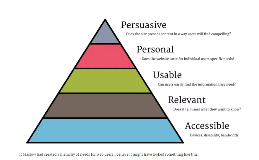
Maslow theory of Usability:
Designing while developing a website with these tools will take the pressure off, so here you go!
Tools:
- Adobe XD
- Figma
- PandaDoc
- Sublime
- Sketch
- Adobe Illustrator
Your website will help you establish a positive digital presence. Don’t forget to include a favicon on your website because it lends credibility to your website. Keep in mind the psychology of your consumer, and design something that aligns with their mental model. If you get overwhelmed, connect with us so we can optimize your website or even design a new one for you!
0 Comments